Introduction to the World of Color Correction
A. Definition of Color Correction
In image editing, color correction is hard. It involves changing an image’s colors to make them look good and accurate. It corrects any variations from the real colors in the original scene. It fixes problems with color balance, saturation, tone, brightness, and contrast.
B. Importance in Image Editing
Colour correction is important to the field of image editing, because it is responsible for maintaining colour integrity.There are a number of reasons why colours appear deformed or inaccurate while taking photos, such as differences in camera settings or poor lighting.These color imbalances, if left uncorrected, can compromise the authenticity of the image and make it more difficult to convey the intended visual messages.
When editors perform colour correction, they aim to produce photographs that fulfil certain artistic or communicative goals in addition to reflecting the realism of the original scene. This method is important for getting a clean and professional appearance, particularly in industries like design, advertising, and photography where precise and vibrant images are crucial.
In essence, colour correction serves as a cornerstone in the image editing workflow, providing the basis for all other improvements and manipulations. Its careful utilisation ensures that the finished product aesthetically beautiful but also true to the intended representation, making it a vital skill in the field of visual media.
Understanding Color Models: Foundations for Effective Color Correction
- RGB (Red, Green, Blue)
Electronic displays are based on the RGB colour model, which uses the additive principle. In this model, different red, green, and blue light intensities are combined to create different colours. The values of each colour channel range from 0 to 255, where 0 denotes no intensity and 255 denotes full intensity. A wide range of hues is generated when these main colours are combined at various levels of intensity. Notably, the result is black when none of the three colours is present and white when all three are present at full strength.
- CMYK (Cyan, Magenta, Yellow, Key/Black)
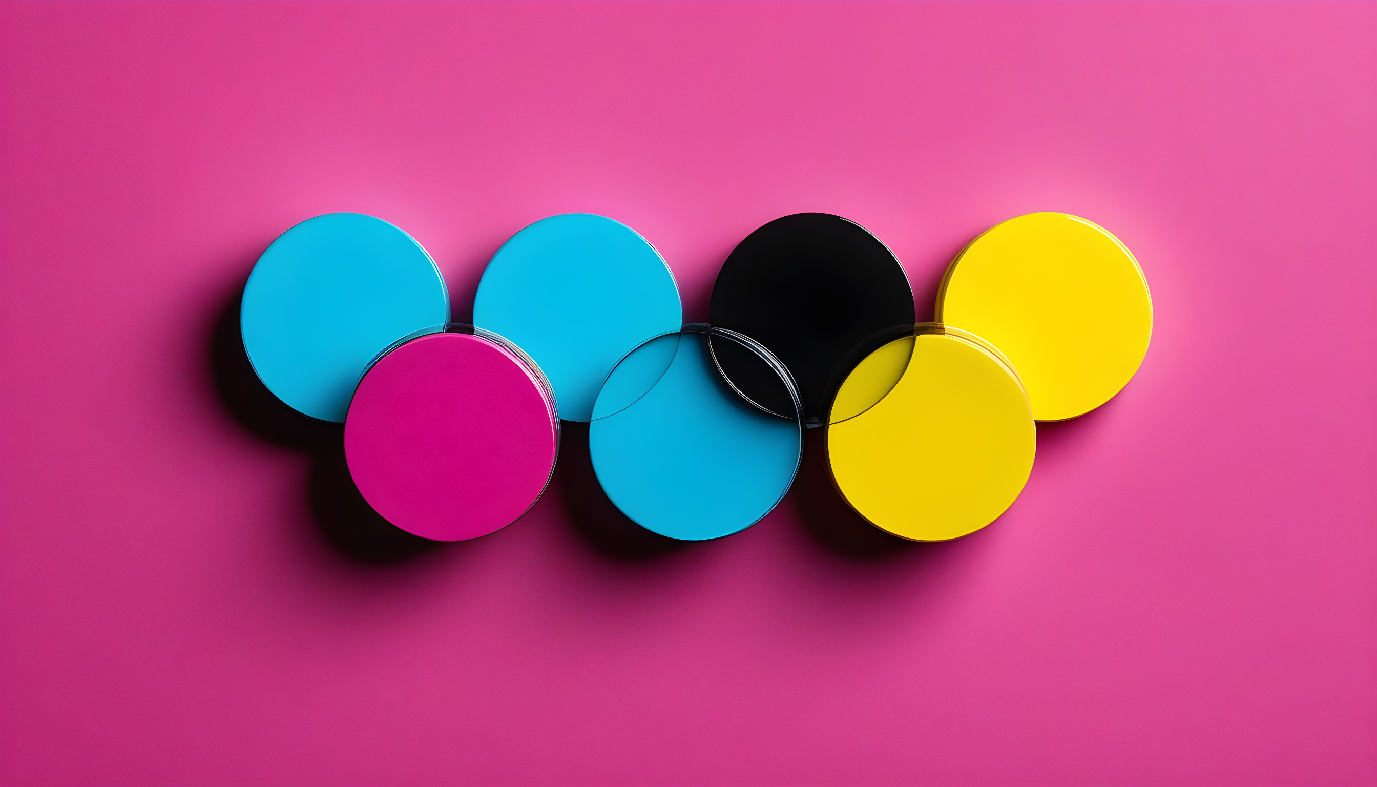
On the other hand, CMYK is a subtractive colour model designed specifically for colour printing. It works by subtracting percentages of cyan, magenta, yellow, and black ink to create a wide spectrum of colours. In CMYK, the “K” stands for key, which is black, black is added to the final printed output to enhance contrast and detail. In the printing industry, this model is vital since it ensures correct colour reproduction on physical surfaces, especially when working with white paper.
- HSL/HSV (Hue, Saturation, Lightness/Value)
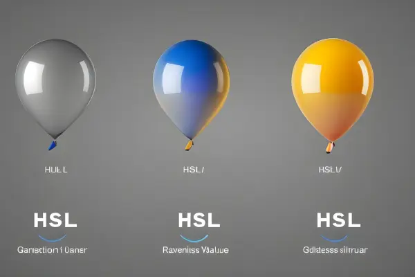
HSL and HSV colour models offer an alternate representation that is more in line with human perception.In these concepts ,colours are conceptualised in a cylindrical space.Saturation indicates the color’s strength or purity, Hue represents the type of color in a circular fashion, and lightness (in HSL) or value (in HSV) refer to its brightness.These models are frequently used by graphic designers and picture editors because they provide a more natural method to work with colours according to their visual properties, allowing for accurate and imaginative modifications.
Expertise in understanding and utilising these colour models is essential for image editing specialists as it allows them to precisely manage and control colours, producing visually attractive and perfectly reproduced images in a variety of media.
Essential Tools and Techniques for Precision Color Correction
- White Balance Adjustment
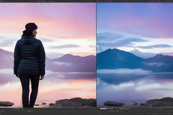
A white balance adjustment is similar to adjusting your photo’s colour harmony. The lighting in an image can generate colour casts, which make whites appear warm or cold, when you capture an image. You can make these casts right with white balance tools, ensuring that whites seem neutral. Making this change is vital for retaining the authenticity of the colours and generating a more accurate and natural-looking representation of the scene.
- Curves and Levels
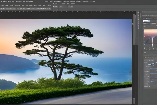
- Color Balance
Colour balance is like a magic wand for changing the overall colour tone of your image.it allows you to adjust the balance between the basic colours red, green ,and blue.This tool is essential for setting the right tone or ambience, weather you want to add warmth to a sunset view, cool down a wintry landscape , or incorporate inventive colour casts.Colour balancing offers the tools to harmonise the entire colour palette in accordance with your artistic vision.

- Hue/Saturation Adjustment
The Hue/Saturation adjustment is the conductor of the colour orchestra.it lets you to exactly arrange the colours in your image.You can change the hue to transform specific colours, change the saturation to make them more vibrant or subdued and alter the brightness to make minor changes.With the help of this essential tool, you can creatively manipulate colour and add a variety of effects and moods to your images.

- Color Grading
Color grading is the storyteller’s finishing touch, establishes the tone and atmosphere of your image.This method involves using particular colour schemes or tones to highlight the narrative and arouse feelings.Whether you use colder hues for a future vibe or warmer tones for a nostalgic feel,colour grading gives your images a cinematic look.it is the finishing touch that turns your images from intresting photographs to intresting visual stories.
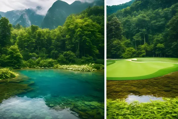
Navigating Challenges: Common Issues and Color Correction Solutions
- Color Casts
Unexpected lighting situations can introduce unwanted colours onto images, causing colour casts. Imagine an orange-hued photograph taken indoors with warm artificial lighting.White balance adjustments acts as the master of colour correction, , balances these casts. White balancing restores the scene’s natural colour harmony by adjusting the colour temperature so that whites seem pure and unadulterated.
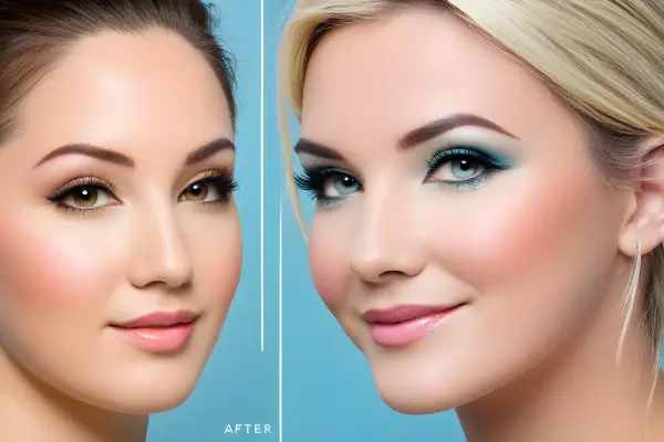
- Over/Under-Saturation
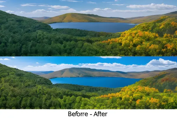
An image’s visual impact can be significantly impacted by the saturation of its colours.When colours are oversaturated it can cause it to become too vivid and can divert attention from the intended subject.on the other hand undersaturation can cause the image to lose vibrancy and look flat.Now for the extensive toolkit of hue/saturation adjustments, which allows editors to carefully balance colour strength.This allows them to improve the richness of colours without compromising realism or they can reduce overlay vibrant colours to create a more subdued natural appearance.
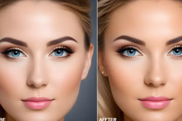
- Tint and Temperature Issues
Photographs taken in a variety of lighting conditions have issues with temperature and tint. While temperature determines an image’s overall warmth or coolness, tint introduces subtle colour variations.Editors tackle these problems with a variety of tools.When white balance modifications are used in conjunction with colour balancing tools colours stay true in the fight against tint.Temperature controls enable editors to further enhance the overall atmosphere through the manipulation of the image’s warmth or coolness.
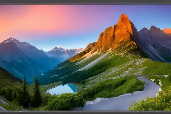
In essence, fixing these typical problems is essentially about maintaining the authenticity of the captured moment. Image editors are equipped with the knowledge and skills necessary to skillfully handle these obstacles, transforming possible dangers into chances for artistic expression.The end result is a visually striking representation of the orginal scene that perfectly captures emotions of the orginal scene.
Step-by-Step: The Art and Science of Color Correction
- Assessment of Image
The process of colour correcting starts with a careful analysis of the image.Editors examine the image closely to spot colour irregularities, examine tone disparities, and understand the lighting circumstances under which it was captured.This step requires a sharp sense of detail in order to identify subtle differences in saturation levels, colour casts, and overall tonal distribution.The objective is to clearly identify the areas for corrections required to restore the image to its optimal visual state.
- Adjustment Layer Usage
Presenting adjustment layers – masters of non-destructive colour correction. Adjustment layers serve as a transparent overlays that allow editors to make precise edits without actually changing the orginal image. Adjustment layers allows you to make flexible and reversible changes to the image without permanently changing the underlying pixels,weather you are adjusting curves, colour balances or levels.This technique ensures that changes can be refined or edits undo at any point during the process.
- Non-Destructive Editing Practices
Colour correction is done with the non-destructive editing motto in mind.Editors welcome techniques that maintain the integrity of the orginal image.This non-destructive toolkit becomes indispensable with adjustment layers, masks, and blending modes.Non-destructive editing methods allows for a more iterative and regulated approach to colour correction by preserving the freedom to review and improve edits without sacrificing the quality of the image
In essence, colour correction can be thought of as a delicate dance between close examination, precise adjustments made with adjustment layers, and a dedication to non-destructive editing practises. In addition to meeting technical requirements, this harmonious interaction guarantees that the final product maintains the artistic intent and emotional connection of the captured moment.
Mastery Unleashed: Exploring Advanced Color Correction Techniques
- Color Matching
Colour matching is more than just basic correction; it aims for a smooth transition between various elements or images. Colour matching provides uniformity in situations where it’s important, such as in branding or a series of images. This sophisticated technique aligns the colour profiles of various images or elements, to create a unified visual identity, To achieve a cohesive and professional outcome, colour matching demands accuracy, whether it’s coordinating tones in different photos or bringing colours in different design elements together.
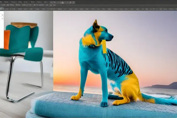
- Selective Color Correction
Selective colour correction explores the subtleties of particular colours in an image.With this technique, editors can target and modify specific colours, as opposed to altering the entire colour spectrum. For instance, bringing out the richness of one colour while reducing the intensity of another. This degree of accuracy offers unmatched control, allowing for creative artistic expression and highlighting elements within the composition.
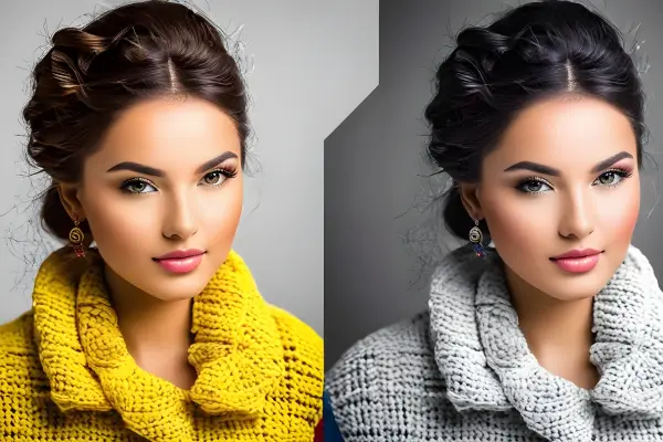
- Gradient Mapping
Gradient mapping adds a sophisticated layer to colour correction allocates distinct colours to various tonal values in an image. It involves moving a gradient onto the tonal range and giving the highlights, mid tones, and shadows different colours. This approach involves adding a stylized, artistic touch in addition to colour correction.By manipulating the colour gradient, editors can evoke particular moods, or produce vintage effects or add a add a modern twist in their images.

These methods offer a sophisticated and imaginative way to refine and improve colours in the field of advanced colour correction, going beyond the fundamentals. These cutting-edge techniques enable editors to push their work to new heights of complexity and visual expression, whether it’s maintaining consistency throughout a series, adjusting colours selectively, or implementing gradient-based tonal shifts.
Optimizing Results: Harnessing Software-Specific Color Correction Features
Filters and Effects in Image Editing
- Adobe Photoshop
Adjustment Layers. The powerful adjustment layers in Photoshop are what make it so powerful. Users can make accurate colour corrections using these layers without affecting the original image through non-destructive editing. These layers offer a dynamic and adaptable method for modifying curves, levels, and hue/saturation.
Color Grading Panel.The Colour Grading panel in Photoshop makes colour correction and enhancement easier to achieve. With the help of simple controls for highlights, midtones, and shadows, editors can easily adjust the colour balance and get the desired look.
Camera Raw Filter. For extensive colour correction, the Camera Raw Filter in Photoshop offers a variety of tools. It gives editors direct control similar to Lightroom, over exposure, white balance, and colour grading within the Photoshop workspace.
- Lightroom
Develop Module.The Develop module in Lightroom is a one-stop colour correction shop. It provides an easy-to-use interface with sliders for changing exposure, contrast, white balance, and colour tones.The ability to work with RAW files directly improves the accuracy and richness of colour correction.
HSL/Color Panel. Lightroom’s HSL/Color panel offers a fine degree of control over specific hues, saturation and luminance.This feature is invaluable for selective colour correction, with the ability to target specific colours within the image for subtle adjustments.
Presets and Profiles.Lightroom’s vast preset and profile library streamlines colour correction workflows. Users can apply preset settings or generate and save their own, assisting with effective batch processing and preserving a uniform appearance across multiple images.
- GIMP
Color Tools. GIMP an open source alternative, offers a powerful set of colour correction tools.The Curves and Levels tools offer users to adjust the tonal range and fine tuning the balance between various colour channels can easily be achieved with the colour balance tool.
Layer Modes. Similar to Photoshop, GIMP’s layer modes allow for sophisticated and artistic colour correction. By blending layers with different modes, users can achieve different effects, like colour overlays or enhancements,
Color Mapping with GEGL. GEGL (Generic Graphics Library) is used by GIMP to allow sophisticated colour mapping. High-bit-depth processing is made possible by GEGL, providing more colour accuracy and versatility for colour correction tasks.
In summary, every software package has a distinct set of features to offer. Adobe Photoshop excels at providing a wide range of tools, Lightroom focuses on efficient colour correction processes, GIMP is an open-source programme with strong tools for precise colour adjustments. The choice is based on the specific requirements and preferences of the user.
Pro Tips: Enhancing Your Color Correction Workflow Effectively”
- Reference Images
Collect Reference Images. Before starting any colour correction, obtain reference photos that illustrate the intended colour scheme or mood. These refrences act as a visual guide.You can achieve a specific look and uphold consistency throughout your project.
Use Split View. Many editing tools that support split views, allowing a side by side comparison of the orginal image and corrected images.using this feature to closely match your reference images, make sure that your colour correction matched your vision.
- Monitor Calibration
Calibrate Your Monitor. Accurate colour representation requires proper calibration of the monitor. Use a hardware calibration tool to make sure the colours you see on your screen are accurate. This step is essential for professionals in the design, photography, or any other field where colour accuracy is important.
Regularly Check Calibration. Monitors can drift over time, which affects the colour accuracy.To keep your colour correction consistent ,recalibrate your monitor on a regular basis.By doing this ,you can be sure that your edits will appear as intended on a variety of screens and print mediums.
- Understanding Color Profiles
Know Your Color Spaces. Variations in colour spaces are used across various devices and media. You must understand the colour profiles that apply to your project, whether it’s sRGB for web content, Adobe RGB for photography, or CMYK for print, This awareness makes sure that your colour corrections will be customised to the desired output.
Embed and Convert Profiles. When working with images, be sure to embed the proper colour profile and convert between profiles as needed. This stops colour changes when transferring files between programmes or hardware. Consistency in colour profiles is essential for precise and reliable colour correction.
These suggestions will help you improve accuracy and make sure your colour correction workflow reflects your creative vision for the edits. Whether you are using reference images, calibrating your monitor, or navigating colour profiles, these procedures help produce efficient and expert colour correction results.
From Theory to Practice: Real-world Applications of Color Correction
- Photography
Portrait Enhancement. Colour correction is essential, In order to achieve natural and attractive skin tones in portrait photography. White balance, saturation, and colour adjustments improve the overall quality of portraits, giving them a polished and professional appearance.
Landscape Enhancement. Colour correction improves the natural element’s vibrancy in landscape photography. By balancing the tones of the sky, water, and foliage. Scenic landscapes are rendered visually appealing and true to life.
Product Photography. Colour representation must be accurate for e-commerce to function properly.Colour correction ensures that products are displayed in their true colours, helps customers make decisions and builds brand trust.
- Print Design
Brand Consistency. Ensuring brand identity in print design necessitates using consistent colours across multiple materials. Colour correction makes sure that logos, brand colours, and marketing materials look the same, to ensure consistent branding recognition in print.
Publication Quality. Colour correction is essential in order to guarantee that images in magazines, brochures, and other printed materials are accurate and vibrant. This improves the overall readability and visual appeal of the publication.
Advertising Materials. Weather it is a promotional materials,like flyers and business cards, colour correction makes sure that promotional materials accurately reflect the intended brand colours.This helps to increase the efficacy of advertising campaigns.
- Web Design
User Experience. In web design ,colour correction enhances the user experience.A website’s readability is improved, key elements are highlighted, and a unified, aesthetically pleasing interface is created when colours are used consistently and with proper calibration.
Branding Online. Websites function as digital storefronts, colour correction is essential for keeping brand colours.This consistency strengthens brand identity and encourage an easy transition between online and offline branding.
Digital Marketing. Colour corrected visuals in digital marketing materials ,like online advertising and social media posts, capture attention and convey messages effectively.The effectiveness of digital marketing campaigns is influenced by accurate colour representation.
In these real-world applications, colour correction affects people’s perceptions and interactions with visual content, which extends beyond aesthetics and affects everything from user engagement to brand perception.In photography, print design, or web design careful colour adjustment is the key factor in achieving professional and noteworthy results.
Navigating Boundaries: Challenges and Limitations in Color Correction
- Loss of Detail
Over-editing Risk. Excessive colour correction, particularly if drastic changes are made to the saturation or contrast levels, can lead to a loss of subtle details in an image.Overediting can lower the overall quality of the final product by causing flattened textures, loss of highlights, or compromised tonal nuances.
Compression Artifacts. When exporting or saving color-corrected images, specific file formats and compression techniques may introduce artefacts.When these artefacts appear, especially in areas with fine details, they can cause distortions or blocky patterns that affect the fidelity of the image.
- Color Gamut Constraints
Device Discrepancies. Due to variations in colour gamuts, colours may appear differently on different devices. When colour corrected on a high-end monitor, an image may appear differently in print or on a regular display. It can be difficult to navigate these differences, particularly if you want to be consistent across different platforms.
Print Limitations. Printers typically have more restricted colour gamuts, In comparison to digital displays. It can be difficult to properly match the colour of on-screen edits to the final printed output. The disparity between the CMYK (print) and RGB (digital) colour spaces may result in unexpected colour shifts could.
- Time Consumption
Iterative Process. To get the correct colour correction, a number of tries and tweaks may be necessary.This iterative process can take a lot of time, especially when working on large projects or when refining edits to meet specific client expectations.
Complex Scenes. Images with complex colour compositions, like scenes with diverse lighting settings, may take more time to edit carefully.It can take a lot of effort to ensure a harmonious colour balance in complex scenarios.
In conclusion, despite being a highly effective tool for improving visual content, colour correction has a number of drawbacks. Some of these include the possibility of over-editing and loss of details , the intricacies brought about by different colour gamuts, and the lengthy nature of the process.Navigating these challenges requires a balance to manage the intrinsic limitations of colour correction tools and workflows while still achieving desired aesthetic outcome.
Bringing Colors to Life: Concluding Insights on the Art of Color Correction
A. Recap of Importance
In conclusion, In the field of creating visual content, colour correction act as a cornerstone. It is important for correcting technical issues as well as improving the visual and emotional impact of images. Whether from photography or design, accurate and intentional colour correction ensures that imagesare not only authentic but also effectively communicate the desired tone and idea.it plays a pivotal role in user experience, branding and successful print and design communication.
B. Continuous Learning in Color Correction
Colour correction is a dynamic field with constantly changing tools, methods, and technologies. It is essential for both professionals and enthusiasts to always be learning. Keeping up with the latest developments and trends guarantees that colour correction efforts are not only effective but also representative of modern visual aesthetics as software changes and new techniques arise. By adopting a mindset of ongoing learning, colour correction professionals can push the limits of creative expression and adjust to shifting demands.
In essence, colour correction can be thought of as both an art form and a technical skill. This allows obstacles to become chances for artistic expression by bridging the gap between the moment that is captured and the intended visual narrative. As technology advances and the role of colour correction in shaping our visual experience will play an increasingly important role.Colour correction is a exciting and ever evolving field to study and become proficient.
Frequently Asked Questions?
What is the difference between RGB and CMYK color models?
The RGB and CMYK color models are two different ways of representing colors in digital and print media. RGB stands for Red, Green, and Blue, and it is an additive color model, meaning that the more color you add, the lighter the result.
CMYK stands for Cyan, Magenta, Yellow, and Key (or Black), and it is a subtractive color model, meaning that the more color you subtract, the darker the result.
RGB is used for digital works, such as websites, TV, or mobile screens, because it can produce a wide range of vibrant colors by combining different amounts of red, green, and blue light.
CMYK is used for print works, such as posters, flyers, or business cards, because it can create different colors by mixing different amounts of cyan, magenta, yellow, and black ink on paper.
Some of the main differences between RGB and CMYK are:
RGB has three primary colors, while CMYK has four.
RGB is an additive color model, while CMYK is a subtractive color model.
RGB produces brighter and more vivid colors, while CMYK produces more muted and realistic colors.
RGB has a wider color gamut (range of colors) than CMYK, meaning that some colors that can be displayed on a screen cannot be printed on paper.
RGB uses different file formats, such as JPEG, PNG, or GIF, while CMYK uses formats such as PDF or EPS.
How can I use curves and levels to adjust the contrast and brightness of an image?
Curves and levels are two powerful tools in Photoshop that can help you adjust the contrast and brightness of an image. They both work by manipulating the tonal range of the image, which is represented by a histogram. A histogram is a graph that shows how many pixels of each brightness level are in the image, from pure black on the left to pure white on the right.
Levels allows you to adjust the black point, white point, and midtone of the image by moving three sliders under the histogram. By doing this, you can stretch or compress the tonal range of the image, making it more or less contrasty. You can also use the output sliders to change the brightness of the shadows and highlights independently.
Levels is a simple and intuitive way to adjust the contrast and brightness of an image, but it has some limitations. For example, you can only adjust the image globally, not selectively, and you can only make linear adjustments, not curved ones.
Curves gives you more control and flexibility than levels, as it allows you to adjust any point along the tonal range by drawing a curve on the histogram. By doing this, you can create complex and non-linear adjustments that can affect the contrast and brightness of the image in different ways.
You can also use curves to adjust the image selectively, by choosing a specific color channel or using a layer mask. Curves is a more advanced and powerful tool than levels, but it also has a steeper learning curve and requires more precision.
What are some common color casts and how can I fix them?
Some common color casts are:
Blue or cyan cast: This can occur when shooting in the shade, under cloudy skies, or with flash. It can make the image look cold and dull.
Yellow or orange cast: This can occur when shooting indoors with tungsten or incandescent lights, or during sunset or sunrise. It can make the image look warm and cozy, but also unrealistic and oversaturated.
Green or magenta cast: This can occur when shooting under fluorescent or LED lights, or with mixed lighting sources. It can make the image look unnatural and sickly.
You can fix color casts using color correction tools present in photo editing programs, such as Lightroom, Photoshop, Affinity Photo, and others. Plus, instead of sophisticated photo editors, you can also try online photo editing programs to fix color cast.
Some of the steps you can take to fix color casts are:
Adjust the white balance: This is the most basic and effective way to correct the overall color temperature and tint of the image. You can use the presets, the eyedropper tool, or the sliders to find the right balance.
Use curves or levels: These tools allow you to adjust the tonal range and contrast of the image, as well as the individual color channels. You can use them to fine-tune the color balance and remove any unwanted hues.
Use color balance or hue/saturation: These tools allow you to adjust the color intensity and saturation of the image, as well as the hue of specific color ranges. You can use them to enhance or reduce certain colors and create a more pleasing color harmony.
Use selective color correction: This is a more advanced technique that allows you to target and modify specific colors in the image, without affecting the others. You can use tools such as the adjustment brush, the gradient filter, or the color range selection to isolate and correct the color cast in certain areas.
How can I use color grading to create different moods and styles for my images?
Color grading is the process of altering the colors of an image to achieve a certain aesthetic or emotional effect. Color grading can be used to enhance the mood, tone, genre, or theme of your images, as well as to correct or stylize the colors to match your creative vision.There are many ways to use color grading to create different moods and styles for your images, depending on the software and tools you use.
Some of the common methods are:
Using a lookup table (LUT): A LUT is a preset file that applies a specific color transformation to your image, such as making it warmer, cooler, more contrasty, or more cinematic. You can use LUTs that are built-in to your software, or download and import custom LUTs from various sources. LUTs are a quick and easy way to apply a consistent color grade across multiple images, but they may not suit every image or situation.
Using color wheels: Color wheels are graphical tools that allow you to adjust the hue, saturation, and brightness of the shadows, midtones, and highlights of your image. You can use color wheels to create color contrast, harmony, or balance in your image, as well as to change the overall color temperature and tint. Color wheels give you more control and flexibility than LUTs, but they also require more skill and precision.
Using curves: Curves are graphical tools that allow you to adjust the tonal range and contrast of your image, as well as the individual color channels. You can use curves to create complex and non-linear adjustments that can affect the contrast and brightness of your image in different ways. You can also use curves to adjust the image selectively, by choosing a specific color channel or using a layer mask. Curves are more advanced and powerful tools than color wheels, but they also have a steeper learning curve and require more accuracy.
What is the difference between color grading and color correction?
Color grading and color correction are two different processes that involve manipulating the colors of an image or a video. Color correction is the adjustment of the color of your footage to make it look more natural and consistent. Color grading is the application of a stylized color scheme to your footage to create a certain mood or effect.Color correction is usually done before color grading, as it fixes any issues with the color balance, exposure, contrast, and white balance of your footage. Color grading is done after color correction, as it adds a creative touch to your footage and enhances the story or the theme of your project.
What is the difference between brightness and contrast?
Brightness and contrast are two terms that describe the appearance of colors and light in an image. Brightness refers to the overall lightness or darkness of an image, while contrast refers to the difference between the light and dark areas of an image.Brightness affects the intensity of light that is emitted or reflected from an object or image. Contrast affects the degree of detail and depth that is visible in an image. By adjusting the brightness and contrast of an image, you can change its mood, tone, and style.For example, increasing the brightness of an image can make it look more cheerful and lively, while decreasing the brightness can make it look more gloomy and somber. Increasing the contrast of an image can make it look more sharp and vivid, while decreasing the contrast can make it look more soft and faded.
How can I use curves and levels to adjust the brightness and contrast of an image?
Curves and levels are two powerful tools in Photoshop that can help you adjust the brightness and contrast of an image. They both work by manipulating the tonal range of the image, which is represented by a histogram. A histogram is a graph that shows how many pixels of each brightness level are in the image, from pure black on the left to pure white on the right.
Levels allows you to adjust the black point, white point, and midtone of the image by moving three sliders under the histogram. By doing this, you can stretch or compress the tonal range of the image, making it more or less contrasty. You can also use the output sliders to change the brightness of the shadows and highlights independently. Levels is a simple and intuitive way to adjust the brightness and contrast of an image, but it has some limitations. For example, you can only adjust the image globally, not selectively, and you can only make linear adjustments, not curved ones.
Curves gives you more control and flexibility than levels, as it allows you to adjust any point along the tonal range by drawing a curve on the histogram. By doing this, you can create complex and non-linear adjustments that can affect the brightness and contrast of the image in different ways. You can also use curves to adjust the image selectively, by choosing a specific color channel or using a layer mask. Curves is a more advanced and powerful tool than levels, but it also has a steeper learning curve and requires more precision.
